
The argument against one is usually right, until it isn't
A design system for an internal tool sounds like polish applied to something that does not need it. For a while that is true. Three screens built by one engineer will be consistent because one person made every decision. The cost shows up somewhere between the tenth and the twentieth screen, when a second engineer joins, and it shows up as time rather than as ugliness. Every new screen restarts a set of arguments that were already settled and then forgotten: how wide is the content column, what does a destructive button look like, does this table paginate, where does the error go, what happens with no rows. The screens still ship. They just each cost a day more than they should, and they disagree with each other in ways users learn to work around.
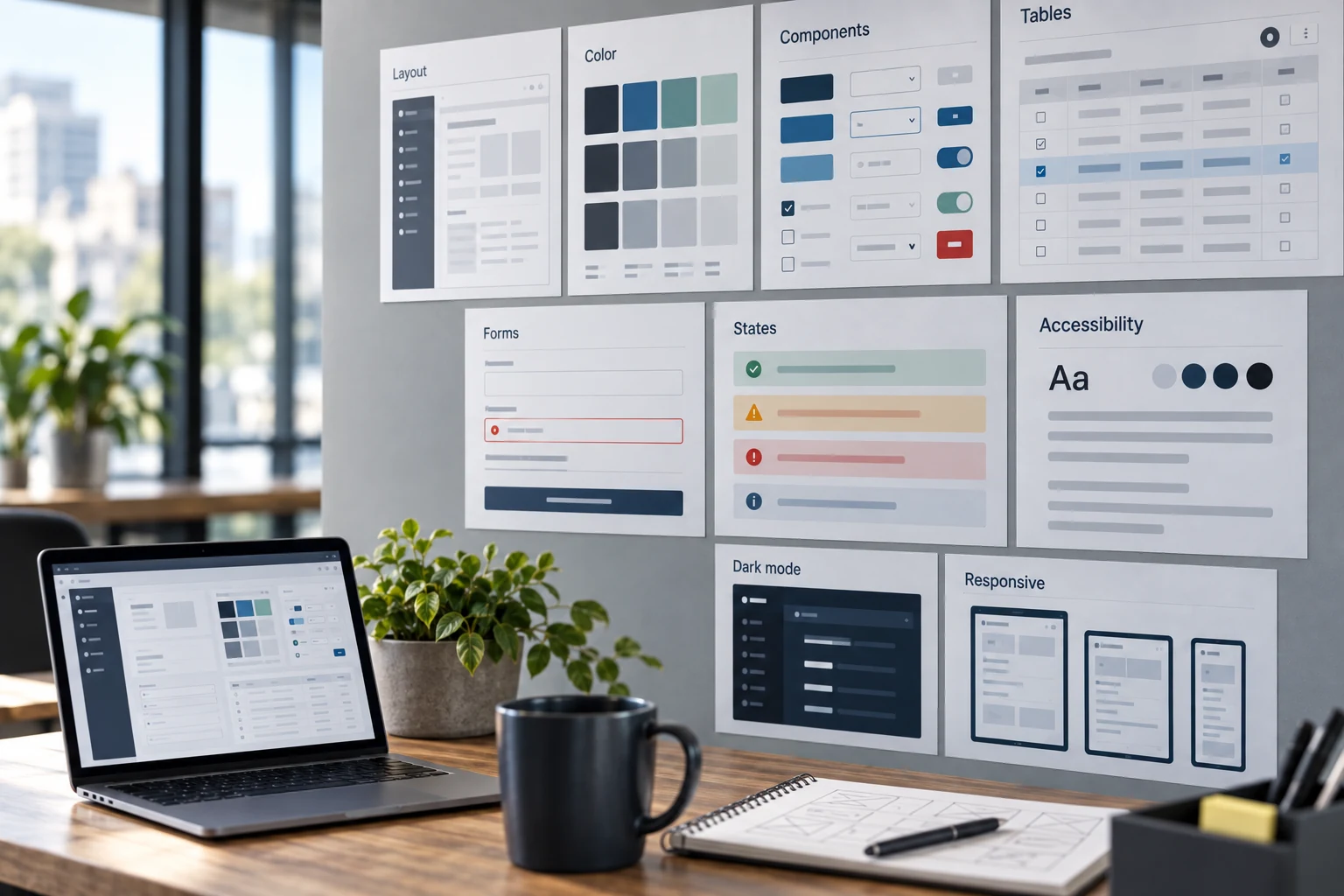

The case for a design system in internal software is not aesthetic. It is that a shared vocabulary removes decisions from the critical path, and that a component fixed once is fixed everywhere. The second point does more work than the first. When someone reports that a table loses its sort order after a save, you want that to be one bug in one component rather than a defect class that recurs in nine places built by four people over two years.
It is also the difference between an internal tool people tolerate and one they trust. Trust in software is built out of predictability, and predictability is exactly what a design system produces: a button in the same place, a confirmation that reads the same way, an error that appears where the last error appeared. Consistency is not decoration. It is what lets somebody use a screen they have never seen without stopping to read it.
You are probably here because
- Two engineers built two screens last month and they do not look like the same product
- Every table in the tool behaves slightly differently and users have learned which ones to distrust
- A screen looked fine in review and fell apart the first time a customer had 40,000 rows
- Somebody is proposing a full rebuild on a component library and you want to know if that is warranted
A rebuild is rarely the answer. An inventory, a token set and five well-built components usually is, and it is four to six weeks rather than two quarters.
Start with an inventory, not a design
Before designing anything, count what exists. Open the codebase and the running application and tally the actual variety: how many distinct button styles, how many spacing values, how many shades of gray, how many typefaces and sizes, how many ways a form reports a validation failure, how many table implementations. Write the numbers down.
The count is usually worse than anyone expects, and that is the point of doing it. It converts an argument about taste into a fact about maintenance. Twelve spacing values in a tool with eighteen screens means every future screen involves picking from twelve options, most of which differ by two pixels and none of which is wrong. Six button variants means a new engineer has to guess. Nobody defends the number once it is on a page, and the inventory becomes the specification for what to collapse.
The inventory also tells you the truthful scope. If the tool has four button variants and three spacing values, you do not need a design system, you need a written note and an hour of cleanup. Do that instead and go build features.
Tokens first, components second
Tokens are the named values everything else refers to: color, spacing, type scale, border radius, shadow, and the semantic layer above them. Get these right and components become easy. Get them wrong and every component encodes the same mistake.
Two layers, always. A primitive layer names raw values, and a semantic layer names roles that point at primitives. Components reference only the semantic layer. This is what makes a dark theme, a density change, or a color correction a change in one file rather than a search across two hundred.
Keep the scales small and boring. A spacing scale of six or seven values covers essentially every internal layout. A type scale of six sizes is plenty. Four to five text colors, three surface colors, and a small set of semantic status colors. Constraint is the feature; if the scale contains every value, it constrains nothing.
Name by role, not by appearance. A token called --color-danger survives the day somebody decides destructive actions should be amber. A token called --color-red-600 does not, and you will find it referenced in a place that had nothing to do with danger.
Where a design system actually saves time — our ranking
Return per hour invested, as we rank it for internal software. Judgment, not benchmark — the ordering is the useful part.
Build from scratch, wrap a library, or adopt one whole
This is the decision that determines how much of your team's time goes into interface plumbing forever. All three options are defensible and the wrong one is expensive in a way that takes a year to notice.
| Approach | Fits when | Real cost | How it goes wrong |
|---|---|---|---|
| Adopt a library as-is Use its components and defaults | Small team, generic screens, no strong visual requirement | Days to first screen; you inherit its upgrade path | You need one behavior it does not have and end up fighting it in every consumer |
| Wrap a library Your components delegate to theirs | Most internal tools, most of the time | One to three weeks up front, then low | The wrapper leaks: consumers import the underlying library directly and the seam stops holding |
| Headless primitives plus your own styling Behavior from a library, appearance yours | Dense or unusual interfaces with real accessibility requirements | Three to six weeks up front | Underestimating how much behavior a table or combobox really contains |
| Build everything Your own behavior and styling | Rarely. A genuinely unusual interaction model | Months, then ongoing | You have quietly taken on maintaining focus management and keyboard behavior forever |
For most internal tools the wrap is the right answer, with one rule that decides whether it works: the underlying library must not be importable from feature code. If both your Button and the library's button are reachable, engineers will use whichever autocomplete offers first, and within a quarter the seam is gone and so is the ability to change anything centrally. Enforce it with a lint rule on day one, not after the drift.
Density is the defining choice, and consumer defaults are wrong
Almost every popular component library is tuned for consumer software: generous padding, large touch targets, roomy line height. Those defaults are right for a signup page and wrong for a screen where someone compares sixty rows for six hours a day. Internal tools are read by people who have learned the domain and want more information visible at once, not less.
Set density deliberately as a token, and make it a property of the system rather than a per-screen fight. In practice a comfortable internal default sits near a 32 to 36 pixel row height with 13 to 14 pixel body text, and a compact mode near 28 pixels for people who want more rows. The specific numbers matter less than the decision being made once, written down, and applied everywhere.
One caution worth saying plainly: density has a floor, and it is set by legibility rather than by taste. Smaller text and tighter rows stop helping the moment people start leaning toward the screen or losing their place across a row. If a user has to trace a line with a finger, the density is wrong regardless of how much fits.
The table is the product
In most internal tools, the table is where people spend the majority of their time, and it is the component teams most often rebuild three times. Decide its behaviors once, in the component, and every screen inherits them.
Sorting and filtering belong in the URL. A view someone can send to a colleague is worth more than most features on the roadmap, and it makes support conversations concrete. It also gives you back-button behavior for free.
Pagination beats infinite scroll for work. People need to know how many there are, get back to where they were, and reason about "the rest." Infinite scroll destroys all three, and it makes printing and screenshotting harder for people who do both more than you think.
Decide the virtualization threshold in the component. Rendering ten thousand rows into the DOM is where internal tools go from fast to unusable, and it is usually discovered by a customer rather than in review. Pick a row count above which the component virtualizes, and test at ten times your current worst case.
Column control, and remembered. Different roles want different columns. Let people show, hide and reorder, persist that per user, and the number of feature requests for new screens drops noticeably.
Bulk selection needs an honest count and an undo. "Select all" across pages must state exactly what it selected. A destructive bulk action needs either a confirmation naming the count or, better, an undo window of a few seconds. Undo is kinder than confirmation and people stop reading confirmations after the third one.
Export is not optional. Somebody will need this in a spreadsheet. If the tool cannot produce a file, the tool is not the source of truth and a shadow spreadsheet appears within a month.
The six states every screen owes, and the four that get skipped
Loaded-with-data is the state everyone designs. The other five are where internal tools embarrass themselves: empty (no records yet, which is a new user's first impression and should say what to do next), loading (with a skeleton that matches the eventual layout so nothing jumps), error (what failed and what to do, never a stack trace and never a shrug), partial (some data loaded, something else failed — the state that most often renders as a lie), permission-denied (say the record exists and access is needed, or say nothing at all, but decide which), and too much data (the search that matched 40,000 rows). Put all six in the component. Reviewing a screen means clicking through all six, not looking at the happy one.
Send us three screens and we will send back the inventory.
Screenshots of three screens from your internal tool, plus a note on team size, to contact@precisionfederal.com. You get back the count of what is actually varying, the three components worth building first, and whether we would tell you to skip the design system entirely. One business day. No charge, no meeting, no deck.
contact@precisionfederal.comForms: validation timing and the save contract
Forms carry fewer hours than tables but generate more anger, and nearly all of it comes from two decisions.
Validate on blur, not on every keystroke. Telling somebody their email is invalid while they are still typing it is a small hostility repeated forty times a day. Validate a field when they leave it, revalidate on submit, and keep the error next to the field rather than in a summary at the top.
Pick one save model and never mix them. Explicit save with a dirty-state guard, or autosave with a visible saved indicator. Both work. A tool where some screens autosave and others do not is a tool that eventually loses somebody's work, and the person who lost it will remember for a long time.
Beyond those: disable the submit button while the request is in flight, or accept that double submission is now your problem. Keep destructive actions out of reach of the primary action, and require typing a name for anything genuinely irreversible. And when a submission fails, keep every value the user entered. Clearing a form on error is the fastest way to teach people to draft in a text editor first.
Accessibility is cheaper as a default than as a retrofit
The reason to build keyboard and screen-reader support into components is not compliance. It is that these behaviors are nearly free when they live in a component and painfully expensive when retrofitted across forty screens. It is also that your power users are keyboard users. The person who processes two hundred records a day will find every place where the tab order jumps somewhere unexpected, and will tell you about it.
Set the floor in the component library: visible focus rings that survive theming, keyboard operation of every interactive element, focus trapped in modals and returned on close, labels tied to inputs, errors announced rather than only colored, and contrast that meets a stated ratio for text and interface elements. Check contrast for both themes if you ship two. This is a week of work built in, and a quarter of work bolted on.
Dark mode, and whether you owe it
If you built two token layers, dark mode is a second set of semantic values and a few hours of correction. If you did not, it is a rewrite. That asymmetry is most of the argument for doing tokens properly even if you never ship a second theme.
Whether to ship one is a use question. People staring at a dense tool for six hours in a dim room ask for it and mean it. Two practical notes: do not simply invert, because pure white text on pure black produces halation that makes dense tables harder to read, and semantic colors need separate values per theme since a status green that reads well on white is usually too dark on a dark surface.
Cost to change after forty screens exist
Difficulty as we rank it, driven by how many files a change touches. The bottom two are cheap precisely because tokens were layered.
Governance, and how these die
Design systems do not usually fail loudly. They fail by being bypassed. Someone needs a variant, the system does not have it, adding it requires a review from a person who is busy, and the local override takes four minutes. Repeat that thirty times and the system describes a product that no longer exists.
Three things keep it alive. Make contribution faster than working around it, which usually means one named owner who can approve a change the same day rather than a committee that meets weekly. Publish a place to see every component in every state, including the ugly ones, so people can tell what already exists before rebuilding it. And measure the bypasses: count local style overrides and direct imports of the underlying library in continuous integration, and watch the trend. A rising count is not a discipline problem, it is a backlog of missing components with usage data attached.
Version it like the internal dependency it is, with a changelog people can read in thirty seconds. A visual change that silently alters forty screens is an incident even when the change is an improvement.
When not to build one
If the tool has fewer than about ten screens and one engineer, write a page of conventions and skip the system. If the tool is being retired within a year, spend nothing. If the screens are genuinely all different, a component library will not help, and forcing consistency onto genuinely different tasks produces the kind of uniformity that hides meaning. And if nobody will own it, do not start; an unmaintained design system is worse than none, because it looks authoritative while being wrong.
The honest threshold we use: two or more engineers building interface, more than ten screens, and an expected life beyond eighteen months. Below that, conventions and a shared table component are the whole answer.
What goes wrong, specifically
- Designing components before counting what exists, which produces a system that fits no screen you have
- One token layer, so a color correction or a second theme means touching every file
- Consumer density defaults on a screen where somebody compares sixty rows all day
- A wrapper the feature code can bypass, which stops being a wrapper within a quarter
- Only the happy state designed, so empty, partial and permission-denied get invented per screen
- A table that renders every row, discovered by the customer with the most data
- Mixed save models, autosave on some screens and explicit save on others
- Contribution slower than the workaround, which guarantees the workaround
A four to six week first pass
Design System First Pass
Step six is the one to protect. A design system validated only against a component gallery is a hypothesis. Converting two real screens is where you find that your table assumed a data shape half your screens do not have, and it is much better to find that in week five than in month five.
Before you call it done
- The inventory count is written down, before and after
- Primitive and semantic token layers exist, and components reference only semantic ones
- Density and content width are decided once, as tokens
- The table handles URL state, pagination, virtualization, column control and export
- All six states exist as shared components, not per-screen inventions
- One save model, applied everywhere, with validation on blur
- Every interactive element is keyboard operable with a visible focus ring
- A lint rule blocks direct imports of the underlying library from feature code
- Overrides and bypasses are counted in CI and the trend is visible
- One named owner can approve a contribution the same day
Bottom line
A design system for an internal tool earns its keep in maintenance, not appearance. The value is concentrated in a small number of places: the table, the six states, the form contract, and two layers of tokens. Build those four well and the rest of the system can stay thin for years. Skip the inventory, skip the states, or let feature code reach past the wrapper, and you will have spent a month producing a second way to build screens rather than a shared one. The test is simple and worth applying every few months: can a new engineer build a correct screen without asking anyone what things should look like? If yes, it is working. If no, the system is documentation rather than infrastructure.
Frequently asked questions
It depends on screens and engineers, not on users. Two or more people building interface, more than about ten screens, and a life beyond eighteen months is where it starts paying. Below that, a written page of conventions and one well-built table component captures most of the benefit for a fraction of the effort. Fifty daily users of a dense tool is actually a strong argument for the parts that affect speed of use, particularly table behavior and keyboard support.
Wrap an existing one for most internal tools. You get accessible behavior and focus management you would otherwise maintain forever, and the wrapper gives you a place to change appearance and defaults centrally. The rule that makes it work is that feature code must not be able to import the underlying library directly — enforce that with a lint rule from day one, because the drift is quiet and hard to reverse later.
Denser than a consumer product and less dense than a spreadsheet. A comfortable default is around a 32 to 36 pixel row with 13 to 14 pixel body text, plus a compact option near 28 pixels for heavy users. Set it as a token so it is decided once. The floor is legibility: if people lean toward the screen or lose their place across a row, it is too tight regardless of how much fits.
The states other than loaded-with-data. Empty, loading, error, partial, permission-denied and too-much-data get invented separately on every screen, inconsistently, usually under deadline. Putting all six in shared components is among the highest-return work in the whole effort, and it is what stops a screen from rendering a partial failure as though it were a complete answer.
Make contributing faster than working around it. One named owner who can approve a change the same day beats a weekly review. Publish a browsable place showing every component in every state so people can find what exists. Then count local overrides and direct library imports in continuous integration and watch the trend — a rising count is a list of missing components with usage evidence attached, not a discipline problem.